"LAKEN" PRODUCT BROCHURE
product brochures
for Heritage Ceramics (China)
year 2019
Lorem ipsum dolor sit amet, consectetur adipiscing elit, sed do eiusmod tempor incididunt ut labore et dolore magna aliqua. Ut enim ad minim veniam, quis nostrud exercitation ullamco laboris nisi ut aliquip ex ea commodo consequat. Duis aute irure dolor in reprehenderit in voluptate velit esse cillum dolore eu fugiat nulla pariatur. Excepteur sint occaecat cupidatat non proident, sunt in culpa qui officia deserunt mollit anim id est laborum.
Sed ut perspiciatis unde omnis iste natus error sit voluptatem accusantium doloremque laudantium, totam rem aperiam, eaque ipsa quae ab illo inventore veritatis et quasi architecto beatae vitae dicta sunt explicabo.
Nemo enim ipsam voluptatem quia voluptas sit aspernatur aut odit aut fugit, sed quia consequuntur magni dolores eos qui ratione voluptatem sequi nesciunt.
MOMENTS ISSUE 01
corporate magazine
for Niro Ceramics (Malaysia)
year 2011
Lorem ipsum dolor sit amet, consectetur adipiscing elit, sed do eiusmod tempor incididunt ut labore et dolore magna aliqua. Ut enim ad minim veniam, quis nostrud exercitation ullamco laboris nisi ut aliquip ex ea commodo consequat. Duis aute irure dolor in reprehenderit in voluptate velit esse cillum dolore eu fugiat nulla pariatur. Excepteur sint occaecat cupidatat non proident, sunt in culpa qui officia deserunt mollit anim id est laborum.
Sed ut perspiciatis unde omnis iste natus error sit voluptatem accusantium doloremque laudantium, totam rem aperiam, eaque ipsa quae ab illo inventore veritatis et quasi architecto beatae vitae dicta sunt explicabo.
Nemo enim ipsam voluptatem quia voluptas sit aspernatur aut odit aut fugit, sed quia consequuntur magni dolores eos qui ratione voluptatem sequi nesciunt.
Neque porro quisquam est, qui dolorem ipsum quia dolor sit amet, consectetur, adipisci velit, sed quia non numquam eius modi tempora incidunt ut labore et dolore magnam aliquam quaerat voluptatem.
"BELLS" PRODUCT BROCHURE
product brochures
for Heritage Ceramics (China)
year 2019
Lorem ipsum dolor sit amet, consectetur adipiscing elit, sed do eiusmod tempor incididunt ut labore et dolore magna aliqua. Ut enim ad minim veniam, quis nostrud exercitation ullamco laboris nisi ut aliquip ex ea commodo consequat. Duis aute irure dolor in reprehenderit in voluptate velit esse cillum dolore eu fugiat nulla pariatur. Excepteur sint occaecat cupidatat non proident, sunt in culpa qui officia deserunt mollit anim id est laborum.
Sed ut perspiciatis unde omnis iste natus error sit voluptatem accusantium doloremque laudantium, totam rem aperiam, eaque ipsa quae ab illo inventore veritatis et quasi architecto beatae vitae dicta sunt explicabo.
Nemo enim ipsam voluptatem quia voluptas sit aspernatur aut odit aut fugit, sed quia consequuntur magni dolores eos qui ratione voluptatem sequi nesciunt.
Niro granite
product brochures
for Niro Ceramics (Malaysia)
year 2005-2012
Niro granite
product brochures
for Niro Ceramics (Malaysia)
year 2005-2012
Lorem ipsum dolor sit amet, consectetur adipiscing elit, sed do eiusmod tempor incididunt ut labore et dolore magna aliqua. Ut enim ad minim veniam, quis nostrud exercitation ullamco laboris nisi ut aliquip ex ea commodo consequat. Duis aute irure dolor in reprehenderit in voluptate velit esse cillum dolore eu fugiat nulla pariatur. Excepteur sint occaecat cupidatat non proident, sunt in culpa qui officia deserunt mollit anim id est laborum.
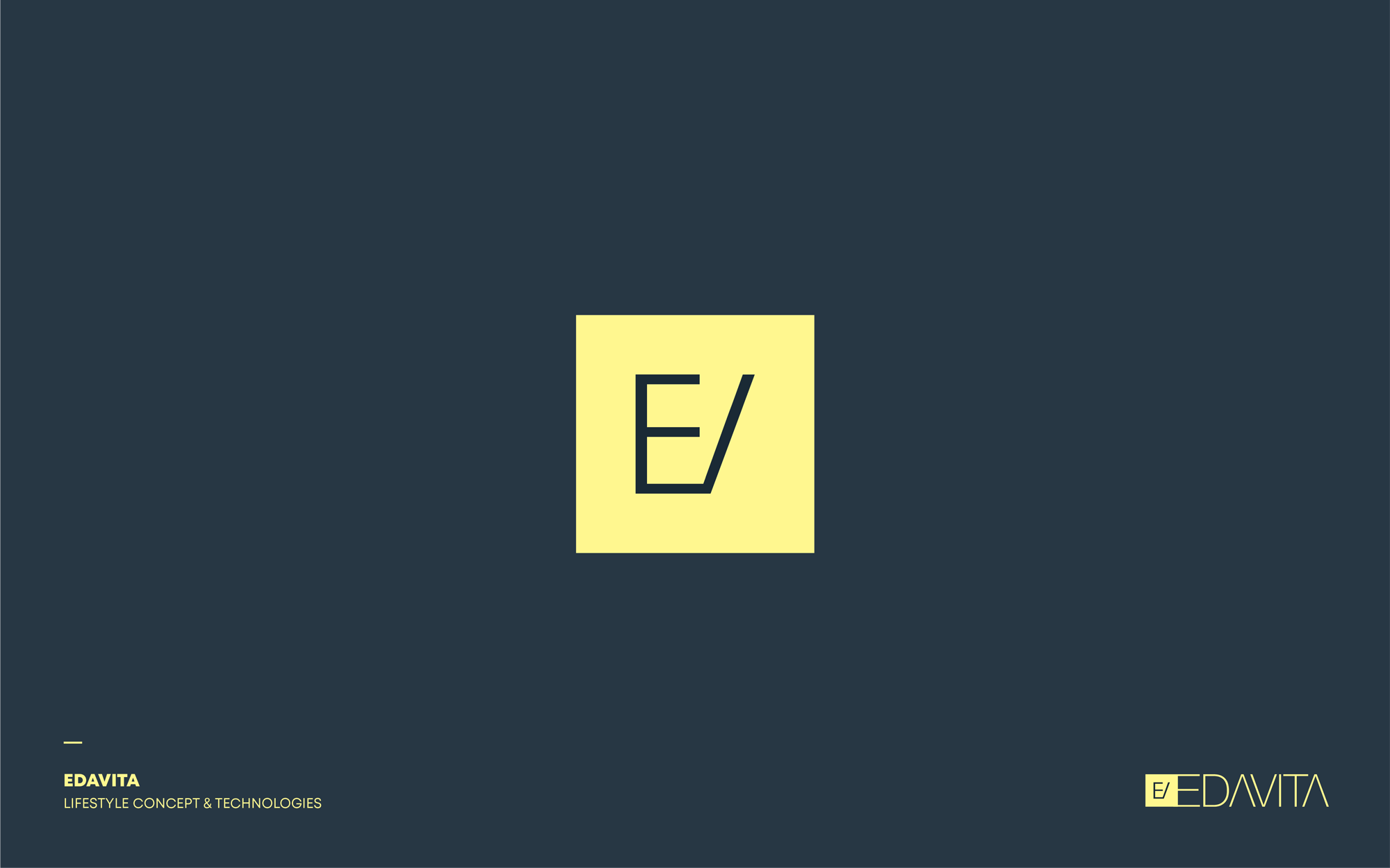
identity design & direction
for Edavita Lifestyle concept (China)
year 2018
EDAVITA’s monogram is a creative visual play of the letter E & V that resembles a wardrobe with partially opened swing door - poetically designed as a metaphor to user experience (dynamic form). The fine linear lines of E & V epitomize beauty in static form. Both dynamic & linear lines form the essence of EDAVITA.
E & V rendered in a sleek and minimalistic approach, encapsulates EDAVITA’s philosophy of marrying simplicity and practicality - focusing greatly on Experience. ‘Experience’ is equally important as ‘Visual’ hence E = experience; V - visual.
With this philosophy in mind, EDAVITA’s product development strategy prioritizes flexibility above all else to ensure the finished products are of exceptional and premium quality in addition to being highly adaptable to accommodate a wide range of consumers with different lifestyle needs. EDAVITA even goes the extra mile by incorporating carefully-thought product detailing into their design such as adding a finer touch on closing and opening mechanism as well as pull and push sensation; elevating their brand several notches higher.


%20.jpg)
%20.jpg)
%20.jpg)