"LAKEN" PRODUCT BROCHURE
product brochures
for Heritage Ceramics (China)
year 2019
Lorem ipsum dolor sit amet, consectetur adipiscing elit, sed do eiusmod tempor incididunt ut labore et dolore magna aliqua. Ut enim ad minim veniam, quis nostrud exercitation ullamco laboris nisi ut aliquip ex ea commodo consequat. Duis aute irure dolor in reprehenderit in voluptate velit esse cillum dolore eu fugiat nulla pariatur. Excepteur sint occaecat cupidatat non proident, sunt in culpa qui officia deserunt mollit anim id est laborum.
Sed ut perspiciatis unde omnis iste natus error sit voluptatem accusantium doloremque laudantium, totam rem aperiam, eaque ipsa quae ab illo inventore veritatis et quasi architecto beatae vitae dicta sunt explicabo.
Nemo enim ipsam voluptatem quia voluptas sit aspernatur aut odit aut fugit, sed quia consequuntur magni dolores eos qui ratione voluptatem sequi nesciunt.
MOMENTS ISSUE 01
corporate magazine
for Niro Ceramics (Malaysia)
year 2011
Lorem ipsum dolor sit amet, consectetur adipiscing elit, sed do eiusmod tempor incididunt ut labore et dolore magna aliqua. Ut enim ad minim veniam, quis nostrud exercitation ullamco laboris nisi ut aliquip ex ea commodo consequat. Duis aute irure dolor in reprehenderit in voluptate velit esse cillum dolore eu fugiat nulla pariatur. Excepteur sint occaecat cupidatat non proident, sunt in culpa qui officia deserunt mollit anim id est laborum.
Sed ut perspiciatis unde omnis iste natus error sit voluptatem accusantium doloremque laudantium, totam rem aperiam, eaque ipsa quae ab illo inventore veritatis et quasi architecto beatae vitae dicta sunt explicabo.
Nemo enim ipsam voluptatem quia voluptas sit aspernatur aut odit aut fugit, sed quia consequuntur magni dolores eos qui ratione voluptatem sequi nesciunt.
Neque porro quisquam est, qui dolorem ipsum quia dolor sit amet, consectetur, adipisci velit, sed quia non numquam eius modi tempora incidunt ut labore et dolore magnam aliquam quaerat voluptatem.
"BELLS" PRODUCT BROCHURE
product brochures
for Heritage Ceramics (China)
year 2019
Lorem ipsum dolor sit amet, consectetur adipiscing elit, sed do eiusmod tempor incididunt ut labore et dolore magna aliqua. Ut enim ad minim veniam, quis nostrud exercitation ullamco laboris nisi ut aliquip ex ea commodo consequat. Duis aute irure dolor in reprehenderit in voluptate velit esse cillum dolore eu fugiat nulla pariatur. Excepteur sint occaecat cupidatat non proident, sunt in culpa qui officia deserunt mollit anim id est laborum.
Sed ut perspiciatis unde omnis iste natus error sit voluptatem accusantium doloremque laudantium, totam rem aperiam, eaque ipsa quae ab illo inventore veritatis et quasi architecto beatae vitae dicta sunt explicabo.
Nemo enim ipsam voluptatem quia voluptas sit aspernatur aut odit aut fugit, sed quia consequuntur magni dolores eos qui ratione voluptatem sequi nesciunt.
Niro granite
product brochures
for Niro Ceramics (Malaysia)
year 2005-2012
Niro granite
product brochures
for Niro Ceramics (Malaysia)
year 2005-2012
Lorem ipsum dolor sit amet, consectetur adipiscing elit, sed do eiusmod tempor incididunt ut labore et dolore magna aliqua. Ut enim ad minim veniam, quis nostrud exercitation ullamco laboris nisi ut aliquip ex ea commodo consequat. Duis aute irure dolor in reprehenderit in voluptate velit esse cillum dolore eu fugiat nulla pariatur. Excepteur sint occaecat cupidatat non proident, sunt in culpa qui officia deserunt mollit anim id est laborum.


"JOYSOW" BRAND IDENTITY
identity direction
for JOYSOW (China)
year 2022
JOY SOW came to us with only a Chinese name, "健源舒屋" — no English name, no visual identity, and a brief calling for an aesthetic rooted in Song dynasty refinement. The company, based in Chengdu, manufactures capillary tube radiant air conditioning systems.
We proposed and finalized the English name "JOY SOW," built to echo the sound and spirit of the existing Chinese name. From there, we developed the full identity: a geometric red logomark, and a custom construction of the Chinese characters "健源舒屋" within the lockup, rather than setting them in an existing typeface. The color system — crimson red paired with a deep, muted olive green — was chosen specifically to answer the Song dynasty brief, favoring restraint over decoration.
The product's five core technical parameters — constant temperature, constant oxygen, constant cleanliness, constant humidity, and constant quietness — were given specifications, not something we categorized ourselves. What we built on top of them was a conceptual translation layer: pairing each parameter with a single character drawn from classical Chinese literati culture — 瓷 (porcelain) for constant temperature, 棋 (chess) for constant oxygen, 書 (calligraphy) for constant cleanliness, 畫 (painting) for constant humidity, 樂 (music) for constant quietness — turning five disconnected specs into one coherent, culturally grounded narrative system.
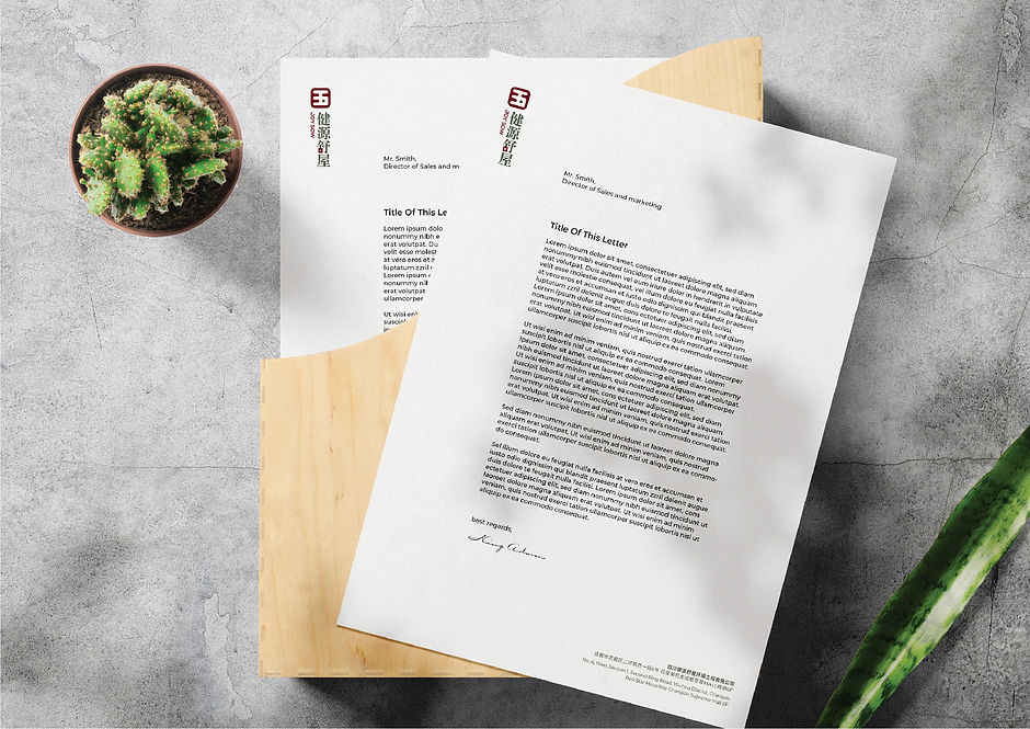
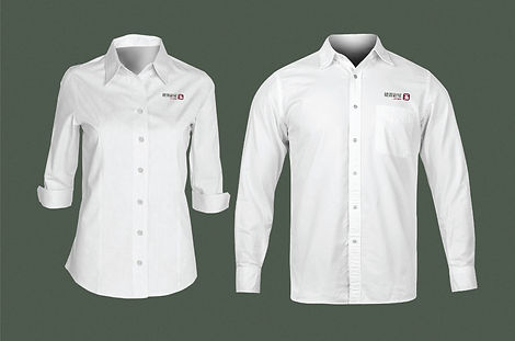
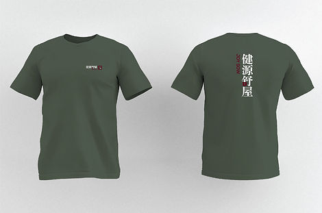
We also wrote the brand slogan, "惜健康 / 觅健源 / 心相聚 / 爱舒屋," and extended the full identity across business cards, letterhead, envelopes, a presentation folder, a branded notebook, staff uniforms, branded cushions carrying the five-character concept set, shopping bags, and a set of brand image collateral built around each of the five parameters.
Scope: English naming, logomark and custom character construction, brand color system, five-parameter concept naming and narrative, slogan copywriting, and full stationery and collateral suite
(Chinese name "健源舒屋" retained from the client's existing brand; everything else developed by our team. Fully adopted and implemented by the client.)
健源舒屋找到我们时,只有一个中文名"健源舒屋"——没有英文名,没有任何视觉识别系统,客户要求呈现宋代美学的雅致气质。这家总部位于成都的公司,主营毛细管辐射空调系统。
我们原创提出并定稿了英文名"JOY SOW",呼应既有中文名的发音与意涵。在此基础上,我们开发了完整的识别系统:一个红色几何标志图形,以及标志组合中"健源舒屋"的定制字形构造,而非直接套用现成字体。红色搭配深墨绿的配色系统,专门为回应宋代美学的要求而选定,追求克制而非装饰性。
产品的五个核心技术参数——恒温、恒氧、恒洁、恒湿、恒静——是既定的产品规格,并非我们自己划分归类。我们在此之上搭建的是一层概念转译:为每个参数匹配一个源自中国古典文人文化的意象字——瓷对应恒温、棋对应恒氧、書对应恒洁、畫对应恒湿、樂对应恒静——将五个原本分散的技术参数,转化为一套统一、具文化根基的叙事系统。
我们也撰写了品牌口号"惜健康 / 觅健源 / 心相聚 / 爱舒屋",并将整套识别系统延伸至名片、信纸、信封、文件夹、品牌笔记本、员工制服、承载五字概念系统的广告抱枕、购物袋,以及围绕五个参数分别制作的品牌形象画。
范围:英文命名、标志图形及定制字形构造、品牌色彩系统、五参数概念命名与叙事、口号文案、全套物料应用设计
(中文名"健源舒屋"沿用客户既有品牌名,其余全部由本人团队原创开发。已完全采纳并落地使用。)