"LAKEN" PRODUCT BROCHURE
product brochures
for Heritage Ceramics (China)
year 2019
Lorem ipsum dolor sit amet, consectetur adipiscing elit, sed do eiusmod tempor incididunt ut labore et dolore magna aliqua. Ut enim ad minim veniam, quis nostrud exercitation ullamco laboris nisi ut aliquip ex ea commodo consequat. Duis aute irure dolor in reprehenderit in voluptate velit esse cillum dolore eu fugiat nulla pariatur. Excepteur sint occaecat cupidatat non proident, sunt in culpa qui officia deserunt mollit anim id est laborum.
Sed ut perspiciatis unde omnis iste natus error sit voluptatem accusantium doloremque laudantium, totam rem aperiam, eaque ipsa quae ab illo inventore veritatis et quasi architecto beatae vitae dicta sunt explicabo.
Nemo enim ipsam voluptatem quia voluptas sit aspernatur aut odit aut fugit, sed quia consequuntur magni dolores eos qui ratione voluptatem sequi nesciunt.
MOMENTS ISSUE 01
corporate magazine
for Niro Ceramics (Malaysia)
year 2011
Lorem ipsum dolor sit amet, consectetur adipiscing elit, sed do eiusmod tempor incididunt ut labore et dolore magna aliqua. Ut enim ad minim veniam, quis nostrud exercitation ullamco laboris nisi ut aliquip ex ea commodo consequat. Duis aute irure dolor in reprehenderit in voluptate velit esse cillum dolore eu fugiat nulla pariatur. Excepteur sint occaecat cupidatat non proident, sunt in culpa qui officia deserunt mollit anim id est laborum.
Sed ut perspiciatis unde omnis iste natus error sit voluptatem accusantium doloremque laudantium, totam rem aperiam, eaque ipsa quae ab illo inventore veritatis et quasi architecto beatae vitae dicta sunt explicabo.
Nemo enim ipsam voluptatem quia voluptas sit aspernatur aut odit aut fugit, sed quia consequuntur magni dolores eos qui ratione voluptatem sequi nesciunt.
Neque porro quisquam est, qui dolorem ipsum quia dolor sit amet, consectetur, adipisci velit, sed quia non numquam eius modi tempora incidunt ut labore et dolore magnam aliquam quaerat voluptatem.
"BELLS" PRODUCT BROCHURE
product brochures
for Heritage Ceramics (China)
year 2019
Lorem ipsum dolor sit amet, consectetur adipiscing elit, sed do eiusmod tempor incididunt ut labore et dolore magna aliqua. Ut enim ad minim veniam, quis nostrud exercitation ullamco laboris nisi ut aliquip ex ea commodo consequat. Duis aute irure dolor in reprehenderit in voluptate velit esse cillum dolore eu fugiat nulla pariatur. Excepteur sint occaecat cupidatat non proident, sunt in culpa qui officia deserunt mollit anim id est laborum.
Sed ut perspiciatis unde omnis iste natus error sit voluptatem accusantium doloremque laudantium, totam rem aperiam, eaque ipsa quae ab illo inventore veritatis et quasi architecto beatae vitae dicta sunt explicabo.
Nemo enim ipsam voluptatem quia voluptas sit aspernatur aut odit aut fugit, sed quia consequuntur magni dolores eos qui ratione voluptatem sequi nesciunt.
Niro granite
product brochures
for Niro Ceramics (Malaysia)
year 2005-2012
Niro granite
product brochures
for Niro Ceramics (Malaysia)
year 2005-2012
Lorem ipsum dolor sit amet, consectetur adipiscing elit, sed do eiusmod tempor incididunt ut labore et dolore magna aliqua. Ut enim ad minim veniam, quis nostrud exercitation ullamco laboris nisi ut aliquip ex ea commodo consequat. Duis aute irure dolor in reprehenderit in voluptate velit esse cillum dolore eu fugiat nulla pariatur. Excepteur sint occaecat cupidatat non proident, sunt in culpa qui officia deserunt mollit anim id est laborum.
"PADUA" IDENTITY
identity re-direction
for Padua Ceramics (China)
year 2019
Originally when PADUA Ceramics approached us, seeking for our creative opinion in regards to their brand direction, we discovered one key problem - assembled wealth of information with ill-defined brand direction.
As a solution, we developed a new brand direction by having a new tagline " Redefine Perfection".


former logo & tagline, "Ceramics. Design. Color" are general terms and did not generate any specific definitions and direction for the brand.
INTRODUCING PADUA NEW DIRECTION WITH NEW TAGLINE


PADUA PRESENTATION
power point presentation
for Padua Ceramics (China)
year 2019
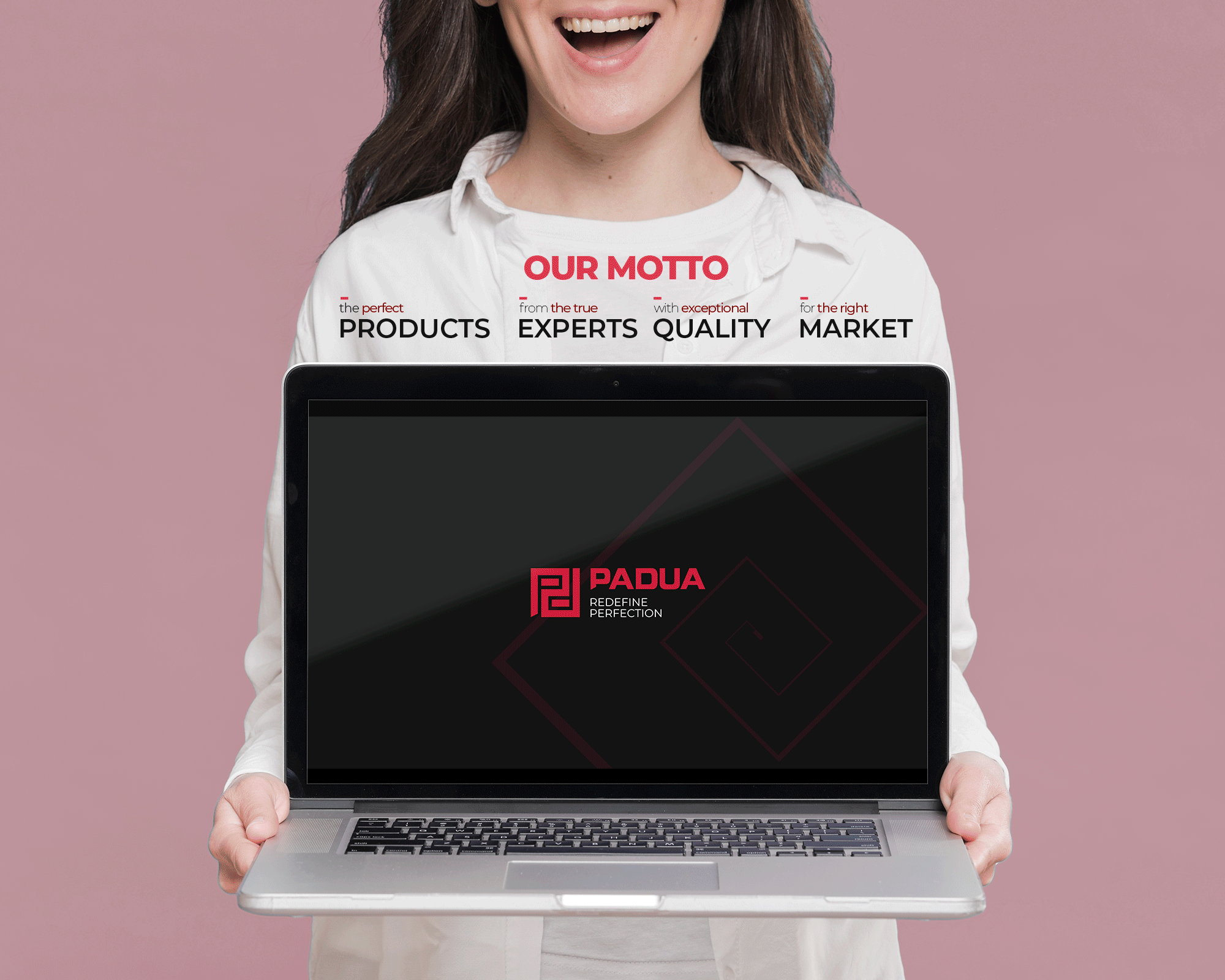
Originally when PADUA Ceramics approached us, seeking for our creative opinion in regards to their presentation, we discovered one key problem - assembled wealth of information with ill-defined content structure.
As a solution, we developed the content structural framework based on the-what-who-how-and-why strategy. We rework their content to fit this narrative, further refined to form a solid statement that has since been adopted as their brand motto - "the perfect PRODUCTS, from the true EXPERTS, with exceptional QUALITY & for the right MARKET. "
The complete full presentation is later partitioned into three smaller but easily digestible presentations - to ease up the company and product onboarding for potential clients and investors alike.
"PAVER 2" IDENTITY
identity direction
for PADUA Ceramics (China)
year 2021
PAVER 2 is a sub brand created for Padua Ceramics for their outdoor tiles.


"ENZO" PRODUCT BROCHURE
product brochures
for Padua Ceramics (China)
year 2020
Distinctive red-coloured stripe on the left side of Padua’s brochure is one of the key elements that defines the visual system. It is designed to draw your attention to the list of product categories.
The categories - Ornaments, Marble, Cement, Stone, Wood & Opus are rendered in slightly darker reddish hue with the exception of that particular brochure category - highlighted in contrasting, bold white text followed by the collection name neatly positioned below the category. This visual system is purposefully designed with two objectives - first, to provide a textual hierarchy and second, to accommodate a subtle way of educating consumers about Padua's product structure and categorization system.
Visuals direction for all brochures are curated following this formula - the cover features close up visuals of each collection’s inspiration in their natural setting, followed by a two page spread of broader view - hinting at the geographical setting each inspiration dwells.
STONE Enzo features visually striking stone formation of a mountain followed by an alpine forest and lake landscape view.
Quote marks are positioned in various formats and opacities throughout the brochure - adding an additional creative touch.


"HIKE PRO" PRODUCT BROCHURE
product brochures
for Padua Ceramics (China)
year 2020

Distinctive red-coloured stripe on the left side of Padua’s brochure is one of the key elements that defines the visual system. It is designed to draw your attention to the list of product categories.
The categories - Ornaments, Marble, Cement, Stone, Wood & Opus are rendered in slightly darker reddish hue with the exception of that particular brochure category - highlighted in contrasting, bold white text followed by the collection name neatly positioned below the category. This visual system is purposefully designed with two objectives - first, to provide a textual hierarchy and second, to accommodate a subtle way of educating consumers about Padua's product structure and categorization system.
Visuals direction for all brochures are curated following this formula - the cover features close up visuals of each collection’s inspiration in their natural setting, followed by a two page spread of broader view - hinting at the geographical setting each inspiration dwells.
WOOD Hike Pro features Sequoia tree in the forest followed with the landscape of a Californian forest with calm lake dominating the foreground.
Quote marks are positioned in various formats and opacities throughout the brochure - adding an additional creative touch.


"LAGOON" PRODUCT BROCHURE
product brochures
for Padua Ceramics (China)
year 2020
Distinctive red-coloured stripe on the left side of Padua’s brochure is one of the key elements that defines the visual system. It is designed to draw your attention to the list of product categories.
The categories - Ornaments, Marble, Cement, Stone, Wood & Opus are rendered in slightly darker reddish hue with the exception of that particular brochure category - highlighted in contrasting, bold white text followed by the collection name neatly positioned below the category. This visual system is purposefully designed with two objectives - first, to provide a textual hierarchy and second, to accommodate a subtle way of educating consumers about Padua's product structure and categorization system.
Visuals direction for all brochures are curated following this formula - the cover features close up visuals of each collection’s inspiration in their natural setting, followed by a two page spread of broader view - hinting at the geographical setting each inspiration dwells.
STONE Lagoon features a close up view of gorgeous and worn out stone structure whittled smoothly by millennia long geological process of water erosion with preceding page depicts coastal gorge.
Quote marks are positioned in various formats and opacities throughout the brochure - adding an additional creative touch.


